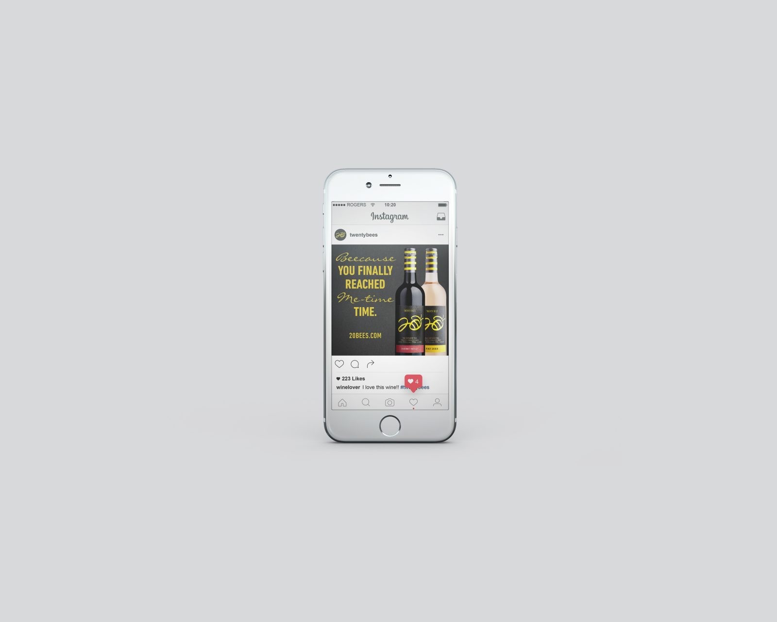
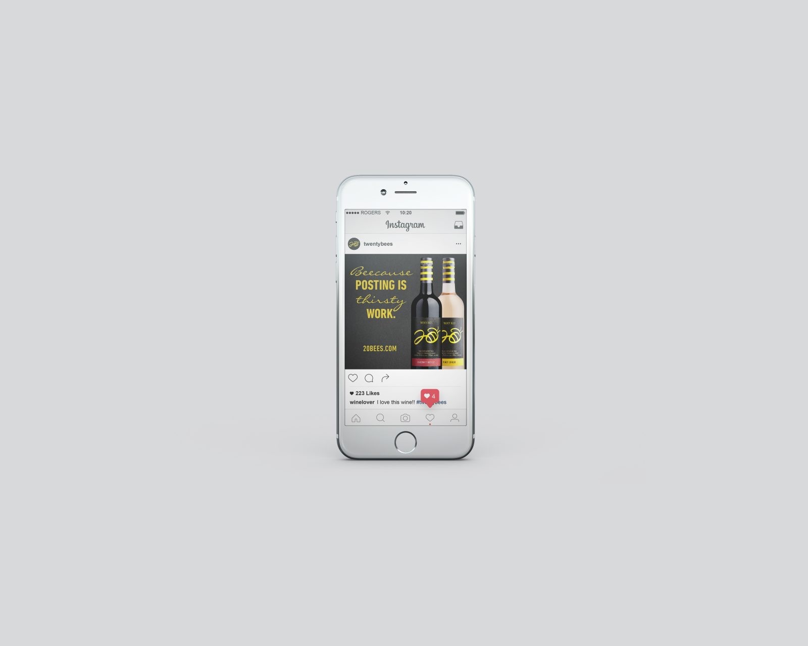
20 Bees had flown into a storm. Sales had stagnated and it faced a declining presence at shelf. Although a very recognizable brand in retail, the packaging was looking dated and not encouraging new trial and consideration from customers. The idea that 20 Bees was “the go-to wine for your any reason” helped us redesign a new story with the creation of “your just Beecause situations”.
The packaging was recreated with a more up-to-date iconic visual language’ focused on the name itself. This made it super easy to spot at shelf while recasting yet retaining a flavour of the original brand’s esthetic. We launched an integrated tongue-in-cheek campaign, bringing to life all the possible “Beecauses” and situations that might inspire pouring the odd glass of 20 Bees.
Results
20 Bees has re-gained multiple listings and prime shelf position and sales have tripled due to the new pack design and support for the brand.
Research
Strategy
Branding
Packaging design
Digital Assets
Advertising Campaign